Startup Executive Compensation Scorecard
In a couple of weeks, CompStudy will release the 2010 survey results with the latest on startup executive compensation. This is the 11th year for the survey and the biggest year ever in terms of participation. Not only that, there are a number of new features that will be rolled out with this year’s survey results; one of the biggest of which is a company “Scorecard.”
The idea behind the Scorecard is to provide a comprehensive benchmark for the management team of a particular company compared to it’s specific peer group. We’ve designed this Scorecard and it’s currently being built, but in the meantime I wanted to get feedback from CEOs and VCs on the feature design. Note that the Scorecard is only available to 2010 survey participants, so if you didn’t take this year’s survey, you’ll just have to wait until next year. And (obviously) only the person who entered the data can see their own Scorecard…we take data security very seriously with the survey.
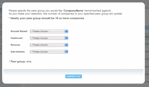
The first part of generating the Scorecard is to select the appropriate peer cohort. From the Scorecard tab in the CompStudy reports section, a user will be able to launch the tool. The options available are seen in the image below.

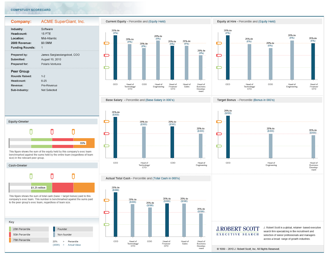
The trick in selecting the best peer cohort is to be specific on as many dimensions as possible, but not so specific that the peer group is too small. Our experience shows that meaningfully appropriate peer groups in the 10 to 30 range are possible for almost all of the tech and life science companies in our database. At this point, the user clicks the “generate PDF” button and voila, you get a high resolution 1-page PDF that looks like the image below.
At the top left of the Scorecard you have your company information and the peer cohort inclusion criteria. To the right of that are five charts one each for:
- Current Equity
- Equity at Hire
- Base Salary
- Target Bonus
- Actual Total Cash
Each of these bar charts shows the respective compensation for the management team on a percentile scale (compared to the cohort). So, for example, the CEO could have a base salary of $190K and be in the 30th percentile, while a VP of Engineering could have the same $190K salary and be in the 90th percentile. For obvious reasons, we compare founders to founders and non-founders to non-founders. [Note in the image above, the data are fake and not to scale…also the number of positions vary in each chart, but that is only to show representative designs for the engineers building the feature. In reality, the same number of positions would show in each chart for one company.]
The idea behind these position-level charts is to give the user a position-by-position assessment on each major compensation component.
The last piece of the Scorecard is in the bottom left. There above the “key” are two horizontal bar charts that show the total cash compensation (Cash-o-Meter) and total equity compensation (Equity-o-Meter) for the management team compared to their peer cohort. This not only gives an idea of the “cash-equity” trade off for this company, but also how that trade off compares to peer companies. One question we debated on these “Meters” is whether to penalize/reward companies for team size. We decided (so far) that if, for example, a company had 4 executives while there peers had 5, we would “reward” them in their score for being people efficient. What do you think, is this the right way to score these metrics?
The idea behind these last two company-level charts is to give the user a macro-level measurement of the company’s executive compensation.
Of course, survey participants will continue to have access to the summary and interactive detail reports that allow specific position-by-position research and analysis.
So, what do you think? Useful? What would you change or add? I would love to hear your thoughts.
